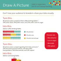
Don't just say it - show it! Spice up those statistics!
Are you seeing eyes glaze over as you try to share portfolio statistics? Can you pinpoint the exact moment you've lost someone?
Statistics are important but let's face it - straight data is not too exciting and all too often you can lose your audience by inundating them.
Instead - draw a picture! Use charts, graphs and colors to illustrate the statistics you're trying to share.
Capture your audience's attention visually.
Pictures are:
- More attractive
- Easier to digest
- Memorable
- Offer options
You're far less likely to lose your audience if you can share your information in a more appealing manner.
Our infographic, Draw A Picture, shows you the difference between sharing statistics as numbers and words versus using charts and graphs. See how you can appeal to your audience visually and keep their attention.


